City ≠ city

City ≠ city. Place ≠ place.

You know when you’re two thousand miles from home and somebody asks where you’re from and you just name the nearby major city even though you actually live in an adjacent suburb, because who the hell would know where that suburb is? I wish we’d think of cities that way for real, not just occasionally out of convenience.

Let’s divorce the geographical notions of “city” and “place” from the legal definitions. I’m tired of people being so hung up on municipal boundaries when they think of their cities. Tired of imaginary lines on maps, having little or nothing to do with patterns of intraurban human settlement, separating “here” from “there.” Tired of people in my city thinking it functions in isolation from the larger city next door, and of people in that city thinking my city is just some other place, hardly different from a town 80 miles away. In your typical American urban area, instead of a great, proud city I see a bunch of heres and a bunch of theres, each one thinking it’s better than the others. Look at it from afar, or even from a hot air balloon. It’s one centralized urban place. One city. In my hippie dream America we’d know where the lines on the map are (let’s face it, they are of civic consequence) but wouldn’t live by them.

Interesting, then, is that these lines aren’t found in many of the maps we all frequently use now. Google Maps will show city names but not their extents. The new Stamen design of Bing Maps is even more wonderfully ambiguous. Here’s the map I see upon entry, showing where it thinks I am.

Bing Maps - city level

I see four levels of place labels, and not all of them correspond to municipal entities. One of the labels is even a place that contains parts of three different cities in three different counties. Most notable, though, is the large, semi-transparent “Boston” label, and I really like the overall impression it gives of the city. I live in Cambridge, which is labeled on the map and clearly is a real place, but its precise definition is unknown, and by the labels it seems to be a part of this greater city called Boston. And that’s just how one should think of the city from this distance.

Bing Maps - neighborhood level

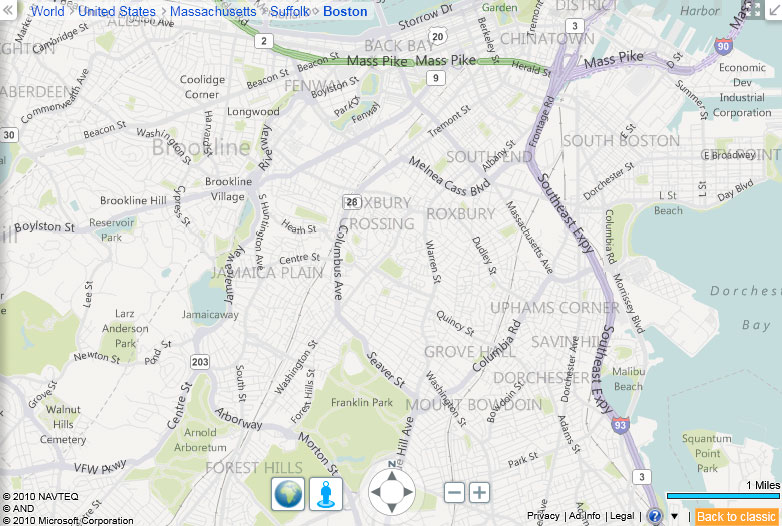
Zoom in a couple of steps and you get a view that is almost officially ambiguous—the ghosted labels name neighborhoods that in my experience don’t have boundaries that any two people would agree upon. (Other cities have more certain neighborhood boundaries, but real neighborhoods are still hard to pin down.) Again the labels do more than allow for display of a hierarchy; they nicely depict the reality of fuzzy, uncertain extents of urban places. In a way, this map is more accurate than one with precise lines. (Bing does show county boundaries, though. Counties are stupid too.)

So here’s to Bing and others reshaping our urban geographical notions. Even if the vagueness is annoying when we wear our Practicing Cartographer hats and are looking for good reference maps.

On a closing note, an excellent attempt to move beyond political boundaries as geographical definitions is the CommonCensus project, which aims to map the spheres of influence of American cities (also sports teams). Have a look at the maps, and please do contribute your response to the survey questions!

CommonCensus map

Tagged , , , ,

11 Comments

  1. You might be interested in another set of subjective boundaries, this time based on flickr tags: http://boundaries.tomtaylor.co.uk/#2367105

    Jim
    21 September 2010 @ 4:01am

  2. You should have a look at the Designated Market Area maps (as the Neilsen corporation presents them). They come close to the Common Sense map of the States. Here’s one place to see: http://www.truckads.com/licensed_affiliates1.asp#usamap

    These are the maps used to sell advertising for radio and television.

    Clay
    21 September 2010 @ 8:18am

  3. @Clay – Thank you for that. I had thought about market area maps but never did look into them. It would be interesting to compare that map as well as the CommonCensus map to actual metropolitan areas as used by the census. The market area map and metropolitan areas are county-based, which kind of sucks, but at least it’s a step higher than the municipal level.

    @Jim – Indeed, that’s a pretty good one. I also considered getting into Flickr shapefiles here but have never quite been able to grasp what they’re all about. It seems to me they speak more to Flickr’s geocoding algorithm than user-contributed place definitions. In my experience, the Flickr tools to change the place name given to a photo are a bit buried, and I would guess that relatively few users ever look for them. They also map geographies that are ostensibly already defined somewhere (the Where On Earth ID, although perhaps these only exist as points), so there is some built-in restriction. I’ve been meaning to ask knowing people about Flickr shapefiles and WOEIDs but never seem to get around to it…

    Andy Woodruff
    21 September 2010 @ 9:57am

  4. Thanks for this Andy, the issue of ontologies of place is increasingly relevant as place is consumed more and more by online applications. The CommonCensus map is an interesting entity in itself, although I suspect that the non-overlapping nature of its sphere of influence is a faulty assumption.

    I wrote a little bit on place and representation with reference to geo-histroy at: http://danieljlewis.org/2010/08/11/carl-steinitz-symap-and-place/

    Dan
    21 September 2010 @ 11:58am

  5. Nice post. I totally agree with this notion that political boundaries are often irrelevant to the masses. Boston is an interesting case study for this though. As you hinted, people in Boston and Cambridge tend to identify with one or the other, not both – even if two thousand miles away (I’m only 1000 miles away and I only identify with Boston… though I’ve never lived within its city limits, but I digress).

    Part of what goes into what “city” people decide to identify as home has to do with what is assumed about the inquirers cognitive map of the area. Another part has to do with how the person being asked would like the discussion to proceed. When someone says to you they went to school “in the Boston area”, for example, are they really assuming that you don’t know where Cambridge is?

    The new design on Bing using transparency for larger labels does give that nebulous, subjective feature effect, but it is also makes the maps easier to read. Either way, they do seem to want the map-reader to know the hierarchy of boundaries and features that surround center of the map (World >> United States >> Massachusetts >> Suffolk >> Fenway, for example). Perhaps their design accommodates hippies AND isolationists?

    Tim
    21 September 2010 @ 1:28pm

  6. Great piece, Andy. I used to work for the city of Boston as a cartographer & GIS manager. I agree with your balloon view of cities but administrators need to draw lines. But then work would often get bogged down in unresolvable disputes about neighborhood boundaries. It was fascinating how people would get bent out of shape about it. Bing’s elegant maps are bringing some perspective by showing what’s drawn on peoples’ mental maps. The maps still look authoritative even without hard, precise lines.

    Martin von Wyss
    21 September 2010 @ 7:36pm

  7. Good food for thought in these comments, all, so thanks for dropping by. I mostly lack the words or wisdom to carry on a good conversation about this. Lots of questions are raised about when lines matter, where they matter, and to whom. Pick any combination of person, location, distance, and purpose, and you get a unique way of defining place.

    I’m glad some issues of space and place in online applications (also more longstanding GIS) have been raised. There’s a lot to think about in that area… definitely worth revisiting.

    Andy Woodruff
    22 September 2010 @ 11:10am

  8. Andy –

    Interesting post. I’ve been thinking about this kind of stuff for a while now – for a variety of reasons. I’ve never lived in the Boston area (unless you count my current home of the Connecticut River Valley as ‘Boston Area’), but I did live in New York for a while. I find New York’s situation to be rather similar to most web-mapping apps’ ‘zoom’ feature. Zoomed far enough out, a large area surrounding New York is “The City”. Zoom in a little bit and only the 5 boroughs actually constitute “The City”. Inside the 5 boroughs, “The City” refers to Manhattan.

    The question about lines, though, is: Who gets to draw them? I get what you’re saying about urban areas and neighborhoods, but at the same time we have to determine who pays the garbage collectors and the snowplows.

    I guess the point I’m trying to make is that geographic lines are pretty much the same as social/economic/racial/sexual lines. If you don’t like them, ignore them. Other people may (and probably will) try to make you conform to their own ideas of what those lines are and where they should be drawn, but you are under no obligation to listen to them.

    Draw your own lines, and stick to them.

    Terry
    23 September 2010 @ 10:16pm

  9. Andy
    Please consider another overlay that would make wise environmetalists think a little bit. “Draw some lines in the sand” that would identify North America’s ecological boundaries.

    Graham
    24 September 2010 @ 12:49pm

  10. Cities are off a bit. For example, Miami is on the Gulf and Cleveland is south of Toledo. Many cities are either in the ocean or one of the Great Lakes.

    Joe
    6 November 2010 @ 9:52pm