Flickr as a paintbrush

What color is Harvard?

Don’t say something like “white,” smartass. But don’t say “crimson” just yet, either.

This being a blog about maps, I of course mean Harvard not as a school but as a geographic entity. What color is the landscape, physical and cultural? When people look around at whatever interests them, what colors are they looking at?

I came up with one way of answering that. Here’s my logic, if it makes sense:

  1. People take photos of what interests them.
  2. Photos typically contain colors.
  3. Flickr has many thousands of geotagged photos in the vicinity of Harvard.

After a few API calls and some code and graphics work, I’ve got a map showing the colors of the physical-cultural landscape around Harvard Square. This is not simply a map of the colors on the ground, which you can get from an aerial photo or systematic documentation like Google Street View, but rather a map of the colors that people on the ground are looking at.

The color of the landscape around Harvard

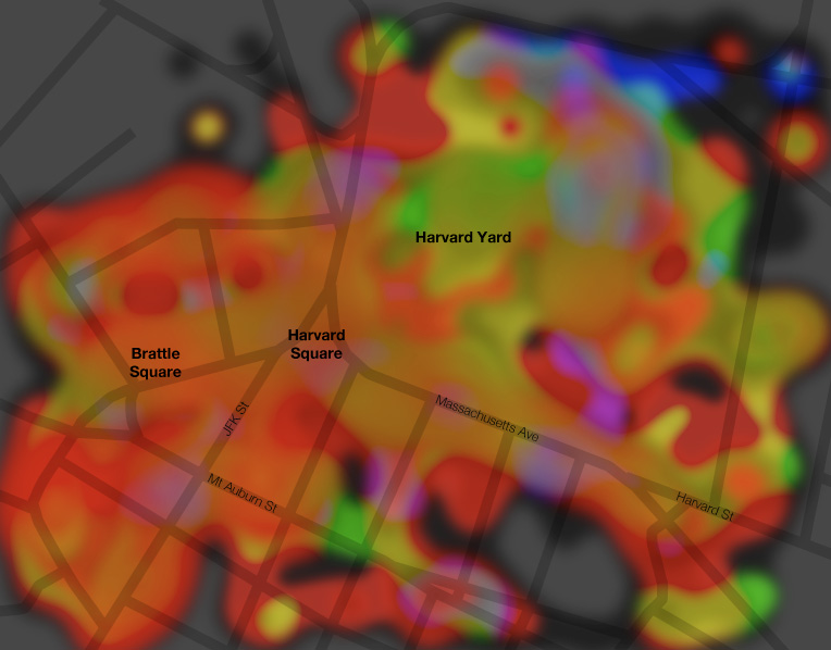
Turns out crimson may be about right, as there’s a lot of red here. But that has less to do with Harvard and more to do with the fact that there is a lot of brick around here. The grass and trees of Harvard Yard are doing all they can to turn the map green in that area and only coming up with something yellowish.

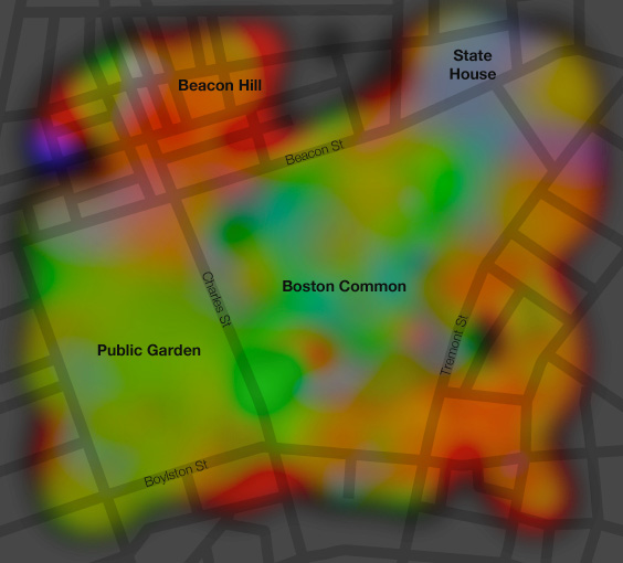
As with much of what I post here, Harvard Square is of course merely a convenient and familiar local cartographic test subject, being just up the street from my home. Here’s another one, Boston Common. Lots of green in the park areas, red and orange in the Beacon Hill neighborhood (bricks again), and kind of blue (sky?) around the state capitol building.

The color of the landscape around Boston Common

Anyway, WTF is going on here? Quite simply, I’ve grabbed about 2,000 photos in each location from Flickr, determined the dominant color in each, mapped those colors, and interpolated liberally. Here are some dirty details.

Flickr API
These maps are based on the most recent 2,000 or so photos uploaded to Flickr and geotagged within the specified bounding box. This is easily accomplished with the flickr.photos.search request. Now, it would be wonderful to make a silly little web app that draws these maps on the fly, but the next step makes it pretty impractical. That is downloading 2,000 images. Even at the “square” (75×75) size, it takes a while.

Dominant color
Here things are fudged a fair amount. I tried a number of ways of simplifying a photograph down to a single representative color. The most obvious option is to calculate the average color, that is, combine the average red, green, and blue values into one color. But too often that results in a dull grayish color because there is too much color variety in the image. Next I tried the color that appears most frequently. It was sometimes better but also frequently just some dark unsaturated color. Then I looked at histograms and combined the most common red, green, and blue values into a single color. That was hit-or-miss and often produced a color that was not representative of the image at all. After a few other attempts, I decided to simplify a lot: get the average color, but only be concerned with the hue; keep it saturated and fairly bright. As such the maps are showing much stronger colors than most photos actually contain, and they poorly represent the occasionally unsaturated photo, but this seemed like the best way to get a set of very general overall colors. Here’s an example of three basic color options, using one of my own photos of a lovely summer day in the Boston Common; the bottom green color seems most representative and is what I’m using on the map.

Example of ways to get the dominant color

Mapping the colors
Easy. Just draw a little square at the location of each photo. Here’s the Boston Common.

Individual photo colors around the Boston Common

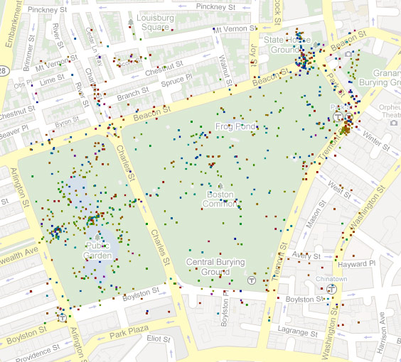
Sometimes there are multiple photos tagged at the exact same location, however. This time I was lazy and did not take that into account, so the color displayed at such a point is simply that of the last photo to be loaded there. I decided it wasn’t too big a deal given the many other points on the map.

Interpolating
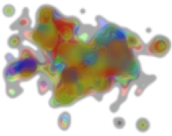
Both of these map extents have thousands upon thousands of geotagged photos within them, but the locations are not at all evenly distributed. To get something more than clustered dots, I employed an interpolation method known as “blurring the crap out of them in Photoshop.” Generally colors fade nicely into one another, but these maps do display some colors that are largely artifacts of the blurring. Still, it works pretty well. I’m sure everyone recognizes the image below as Boston, right? (A shiny nickel to anyone who can explain why Allston-Brighton is so strongly blue/purple, so that I don’t have to go over there and find out for myself.)

Colors of Boston

In conclusion, call this stuff a work in progress, as I’d like to pursue it further, maybe just because looking at trippy images is fun. There must be a lot of locations that would produce interesting maps. Suggestions?

Tagged ,

41 Comments

  1. Imressive!

    Ole @ Landmarcs
    21 October 2009 @ 11:22pm

  2. Very cool. A bit like remote sensing.

    Jason
    22 October 2009 @ 1:00pm

  3. Neat concept. I think that instead of just choosing a fixed saturation value, you should just rescale the saturation so that the maximum on a given map is fully saturated. This would give a much better sense of the variation of photos, while still making for striking differences. As is, there one can’t distinguish variations along the same hue angle.

    Dean Eckles
    25 October 2009 @ 5:29pm

  4. Dean: Indeed, this is very limited in showing real variation, and I decided to give up on that. Yours is an interesting idea, though. Simply basing it on the maximum value might not help because there might still be that one very saturated photo in the mix, but surely there is a scheme to increase saturation of the dull colors without uniformly maxing it out for everything. I’ll be sure to try something like you suggest if/when I generate more of these.

    Andy Woodruff
    25 October 2009 @ 5:58pm

  5. This is just quite simply amazing. Thank you. Twittered.

    Frode Hegland
    28 October 2009 @ 3:34am

  6. This is a really fun way of looking at things. It may also be interesting to see what would happen if you employed an interpolation method that would chose a nearest neighbor method to assign hue to pixels. That would avoid the color smearing problem when colors are mixing with their neighbor pixels currently.

    Karen
    28 October 2009 @ 5:56am

  7. Beautiful work, algorithms and results.

    Would love to see results from the Brooklyn Botanic Garden. The Flickr group http://www.flickr.com/groups/bbgv/ is a good place to start, with nearly 5,000 photos. Typical tags are “Brooklyn Botanic Garden” and BBG.

    For outdoor settings, would also be interesting to see if seasonal differences show up. How do fall, winter, spring and summer compare?

    Flatbush Gardener
    28 October 2009 @ 7:37am

  8. Nice ap! Would love to see how it changes over time… right now it should show lots of reds and oranges with the fall… but come winter the dominant color should be white!
    Great post.

    Bonnie
    28 October 2009 @ 8:45am

  9. Wow, this is fun. I like how you’re using the technology to help you think about how you think about your neighborhood. I teach interpolation to students in my GIS II course and I think they’ll like to learn about your new “blurring the crap out of them” interpolation algorithm 🙂

    Cartographer
    28 October 2009 @ 9:19am

  10. you should have applied delaunay triangulation and filled triangles with gradients. there are ready codes for both.

    makc
    28 October 2009 @ 9:39am

  11. Thanks for all the comments and suggestions! When I next get a chance, I’d like to try something along the lines of just about everything said so far. Time and seasonal differences are definitely something I thought about but didn’t get around to looking at (owing to laziness). And Flatbush Gardener, I’m guessing the Brooklyn Botanic Garden might make a nice map, so I’ll be sure to try that location.

    As for interpolation and such, Delaunay triangulation is good idea, at least because I think I can manage to pull it off. Something better than the “blurring the crap out of them” method (though I submit that that be a valid method from now on!), in addition to removing some of the artificial hues in these maps, might allow more subtle desaturated colors to be used without everything looking like a dull mess.

    Andy Woodruff
    28 October 2009 @ 10:25am

  12. Would like to try this in the South Florida Region (Miami, Ft. Lauderdale) not many seasonal issues here! This is a full blown project. please post any shortcuts you develop.

    Tom Pennavaria
    28 October 2009 @ 11:41am

  13. Andy: Perhaps just use the maximum with a non-linear scale. Or don’t pick the max by photo, but by area — farther along in the process.

    Dean Eckles
    28 October 2009 @ 1:27pm

  14. Great work. I’d love to see this on a larger scale.

    I’ve done a little bit of work on extracting color statistics from images

    http://mkweb.bcgsc.ca/color_summarizer/

    Might be helpful to you.

    Martin Krzywinski
    28 October 2009 @ 2:38pm

  15. Martin, wow, thank you! Looks like an excellent tool; it just might be perfect for this project. (After a glance at your site, I’m also looking forward to checking out all your other work!)

    Andy Woodruff
    28 October 2009 @ 2:57pm

  16. Nice idea, I’m curious if the colours of e.g. Nepal, Kenia etc. correspond with Flexa’s couleur locale colors http://img406.imageshack.us/img406/8697/flexacouleurlocale.jpg

    ReneSmit
    28 October 2009 @ 4:05pm

  17. I’ll check back in when you calculate the scale of each image to account for the difference between close-ups and, say, panoramas 😉
    Neat project.

    Phir Muerureyree
    28 October 2009 @ 6:09pm

  18. Here’s another idea: what if you got the average hue of the photo’s central area, and of its periphery? Then you’d have the colours of what people are focusing on, and the colours of their surroundings.

    Tim Bennett
    28 October 2009 @ 8:52pm

  19. Awesome project! These maps are great. re: Allston-Brighton- is that Allston-Brighton, or Chestnut Hill Reservoir? I imagine photos in that area would be pretty blue…

    Camgirl
    30 October 2009 @ 8:13pm

  20. The whole Boston blob doesn’t quite go as far as Chestnut Hill Reservoir. The purple spot is centered in Allston right at Harvard and Brighton Avenues, and extending a bit west. Based a few minutes of Flickr research, I am hereby choosing to blame the Allston Village Street Fair on September 20. There seem to be some bluish-purplish photos from that. If true, it underscores what several people have said about a temporal component to all this.

    Andy Woodruff
    30 October 2009 @ 8:56pm

  21. You may want to try out the fields package in R for your smoothing. They have an example under image.smooth where they take a set of samples over a plane and smooth it.

    http://cran.r-project.org/web/packages/fields/fields.pdf

    Edward Ratzer
    13 November 2009 @ 1:52pm

  22. I had very similar idea few years ago and was trying to find colors associated with typical keywords on flickr. Say, fire should be red. I also faced problem of average color being dull grey and pretty much get discouraged by that and stopped there.

    Great job and very neat visualizations!

    Vadim Zaliva
    14 November 2009 @ 11:51am

  23. Interesting,i wonder if u would use the GIS application,u can change all colors(1-255)to data(001-255),than we can depict a graphic which has all the 255 colors, finally we use interpolation to have the results.

    for the selection of the colors, my advise is that u can use write a script to chose one color which is the most large in a picture

    coopix1
    15 November 2009 @ 1:55am

  24. Can you make a online thing to let people get the color map of anywhere in the world that got geotagged pics avaiable please?

    TiagoTiago
    10 June 2010 @ 5:56pm