I hate your favorite election map

I am not by nature an angry person—in fact my friends at times find me irritatingly even-tempered—nor am I known to truly hate anything, but provocative titles have their place, right?

We’ve once again arrived at that special time of (every fourth) year when the internet abounds with maps, charts, and other graphics attempting to depict and analyze every geographic and demographic angle of the US presidential election. I am happy for these, both in the perspectives they provide on the election and in the demonstration of interesting visualization methods.

But as a cartographer in the eternal quest for the Perfect Map, I find myself complaining about some map and graphics. In particular, I take exception to this:

2004 presidential election cartogram

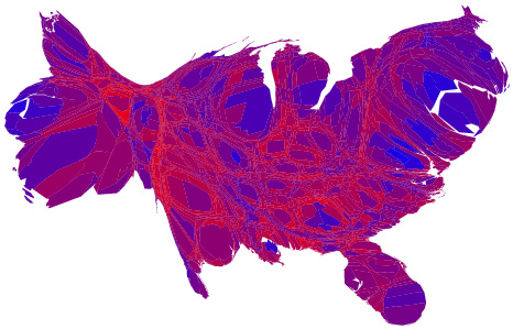
For anyone who doesn’t know, the above is a cartogram (’bout time I wrote about that which my site is named after!) of the United States, in this case a map by Michael Gastner, Cosma Shalizi, and Mark Newman showing the results of the 2004 presidential election by county (we’ll soon be seeing one for 2008). A cartogram is a map that does not strive for geographic accuracy, but rather in which the area of units actually represents some value. In the election map, each county’s size represents its number of voters. The point of the map is to show that while a geographic red-blue election map would show an apparent vastness of Republican votes, those “red” areas actually account for about the same number of votes as the tiny “blue” areas. (The message is further conveyed by coloring counties along a red-blue continuum to show the actual balance of votes rather than simply coloring by the winner, something first seen in Robert Vanderbei’s election maps.)

I’ve written several drafts of many paragraphs to try to explain my opinion, but really, who has time to read all my ranting? Short version: apologies to Drs. Gastner and Newman, but as a cartographer interested in clear and effective design, I really believe that cartograms generated from their method are severely over-hyped and far more popular than they should be. Consider the election map (or any number of examples)…

  • Ugly! All that puckering and bloating… I wouldn’t want to share an elevator with that America.
  • Topology preservation at the expense of shape: even if I know what a county looks like on a normal map, I’m going to have a hard time identifying it here.
  • On shape, still: curvy shape distortions are harder to recognize than simplified polygonal shapes.
  • The overall distortions leave me gleaning only about five things from this map: east, west, Florida, Michigan, and that there is roughly the same amount of blue as red. Yes, I know that last one is the whole point, but if I can barely discern the geography, why bother to use a map? There are lots of cool visualization works that deserve attention too.
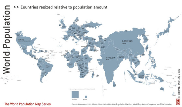
  • Fast and easy cartograms (including this particular map) are not useless, and the work by Gastner and Newman is an important contribution, but there are under-appreciated careful designs out there. Consider the excellent cartograms from Mapping Worlds:

World map, Mapping Worlds

The bottom line is that many—perhaps even most—cartograms are essentially used for shock value, for the “holy crap, that’s a different perspective!” response, which is exactly what they get. Too frequently they can’t stand as maps on their own. I think the election cartogram is only of use when it’s next to an undistorted map. The best maps and graphics are those that tell their story clearly and elegantly, not those that simply evoke an emotional response. There are a million good reasons why I’m wrong to complain, but rather than going on and on in an attempt to counter them I will simply acknowledge that they exist and expound later if necessary.

“Put your money where your mouth is, jackass!”
Oh, actually that’s a pretty important reason I’m wrong to complain. Okay, I promise I will attempt to come up an alternative visualization of the same information as that election cartogram, as soon as I figure out where people find such detailed election data so quickly. (And, as I stressed “careful design,” it’s not going to be instant.) I’ll also keep an eye out in the coming days for maps and graphics that I think are more effective.

Having deleted most of what I previously wrote for this post, I wasn’t left with a good place to bring it up, but I must, as I seem to do in nearly every alternate post, refer to the work of my mortal enemy Zachary Johnson, who wrote his master’s thesis on cartogram designs in political maps. (He should be writing about this stuff. Maybe someday he’ll at least finally write about his findings. Eh, Joncy?) At the University of Wisconsin-Madison, specifically in room 412 Science Hall, we did not take cartographic research seriously if it could not be depicted by a cube. As such, Zach defined a cartogram typology (Cartogram3) by three characteristics: shape preservation, topology preservation (the preservation of boundaries and connectivity), and density equalization (essentially, how accurately area corresponds to value). No cartogram can be perfect in all three, and in fact most compromise all three to some degree. Zach tested several designs, each making different sacrifices, in political map-reading tasks. Note that I have bitched about shape preservation versus topology preservation. His research backs me up in some respects, but not in others. But I’m not in academia anymore; I don’t need “research” to know that I’m right!

Tagged , ,

11 Comments

  1. Seems to show the biases built into cartographers are not universal, because most of us really like these distorted monstrosities.

    This isn’t meant to be a diss: your field likely has very good reasons to drill certain ideas of what counts as good into your brains.

    Eric Thomson
    7 November 2008 @ 5:14pm

  2. We do have our supposed rules and principles, but I’ll be honest: the fundamental bias built into cartographers is the attitude that professional cartographers are the only ones who should be trusted to make maps and that the popular maps by the untrained masses are BAD, for whatever list of reasons that the elitist professional keeps at the ready in his front pocket. The noble goal is to offer guidance to that democratized cartography, but it doesn’t often come off that way. You should see the circle jerk that is professional cartographers discussing internet maps (consensus: they all suck). Sometimes it’s probably just a fear that the trained, professional cartographer will become obsolete and that it will turn out we’ve all made a terrible career choice.

    I like to think that some of us younger cartographers recognize that we aren’t the arbiters of “good” maps, but that we can be valuable, and that we earn our worth not by sitting around cursing the amateur mapmaker but by getting on board and contributing. Inevitably, sometimes it is going to come down to expressing some elitist opinion, as here. I’ve deliberately taken an insulting (though I hope light) tone, but really the point is to remind that while there’s nothing wrong with liking the popular map (even if I don’t), there may be something better out there.

    I hope I’ve now accomplished insulting both amateur and professional cartographers!

    Andy Woodruff
    7 November 2008 @ 7:34pm

  3. I don’t mind the cartograms which portray information on a state-by-state level. You’ve picked a particularly ugly one, which uses not two colors but a gradient between the two colors, and divides the map into small unrecognizable pieces. The states are still identifiable in the distorted maps, but the counties remove this link to topographic reality.

    Jon Peltier
    13 November 2008 @ 1:18pm

  4. Indeed, and I thought about that as one of the many counterpoints to what I ended up writing in this post. Counties vs. states makes a big difference. Although I still find a bloated cartogram at the state level displeasing, it’s mostly readable. Much of what I said is easy to defend only for that one particular map I posted, but hopefully some of the principles can stand in general too.

    Andy Woodruff
    13 November 2008 @ 2:11pm

  5. Boy, I’m a little late to the table here, but:

    Myself and my partner were just flipping back and forth between the Gastner/Newman/Shalizi version of the population map (http://www-personal.umich.edu/~mejn/cartograms/) which I assume you hate, and the Mapping Worlds one you present here, and we decided that the Mapping Worlds version does a job of cleanly conveying the population variable, but the bloaty Gastner version is capable of conveying both population and also density.

    So there’s that.

    By the way, your link to the Mapping Worlds version is dead.

    Did you ever do that nice version of the Election cartogram you promised? I suppose I could get off my ass and search.

    Hugh Stimson
    20 November 2009 @ 12:29am

  6. How do you get the density? Since size corresponds to population, every country on either map should have the same density. Is it that on the Gastner/Newman/Shalizi map, it’s more apparent where the distortions are? So you can tell that Country X has been blown up from small to large and therefore has a high density?

    On that last note, the Worldmapper team has some interesting new maps in which they included a grid, so you can clearly see the distortions. That would seem to allow you to tell the high density areas from low density areas without having to be familiar with the undistorted geography.

    My attempt ended up being this (with a few variations here). Rather than varying size like a cartogram, it uses transparency to “equalize” the map units. Reviews were mixed last year; some people seemed to think it was great but others were not convinced. I ended up co-authoring a paper to propose the technique (which we called “value-by-alpha”)… one of these days I mean to write a blog post about that.

    Oh, and thanks for the tip in the Mapping Worlds link!

    Andy Woodruff
    20 November 2009 @ 9:59am

  7. “So you can tell that Country X has been blown up from small to large and therefore has a high density?”

    Yeah bingo, there’s something about the distortions such that the heavily adjusted shapes are obviously a-geographic to the eye, and consequently they just sing out at you. That makes countrys whose population:size ratio is off-average jump right out visually.

    Also: what’s up with Brazil, doesn’t it know this is a cartogram?

    While arguing about this with my girlfriend, I made the point that if what you were interested in was just popluation, that effect was a *bad* thing, because it distorted the key variable, and the World Mapper version more directly communicated that info. But she made the point that it was a good thing in that it effectively communicated 2 variables at once and intuitively: population /and/ density.

    Yes I sat around on a thursday night and argued about cartograms with my girlfriend. What’s wrong with that?

    Thanks for the link to the new worldmapper maps, I was trying to find that and failed. I did however track down the transparency-based election cartogram. I liked it, she didn’t, go figure. I do think that the point raised in the comment thread that colour value perception is mediated by adjacent colours is significant in that context.

    Hugh Stimson
    20 November 2009 @ 1:54pm

  8. “Yes I sat around on a thursday night and argued about cartograms with my girlfriend. What’s wrong with that?”

    Hugh, it honestly sounds like you have a perfect life!

    Andy Woodruff
    21 November 2009 @ 9:59pm

  9. Even tempered? What friends?!

    Tim Wallace
    6 November 2012 @ 3:35pm