By Andy Woodruff on 24 March 2016
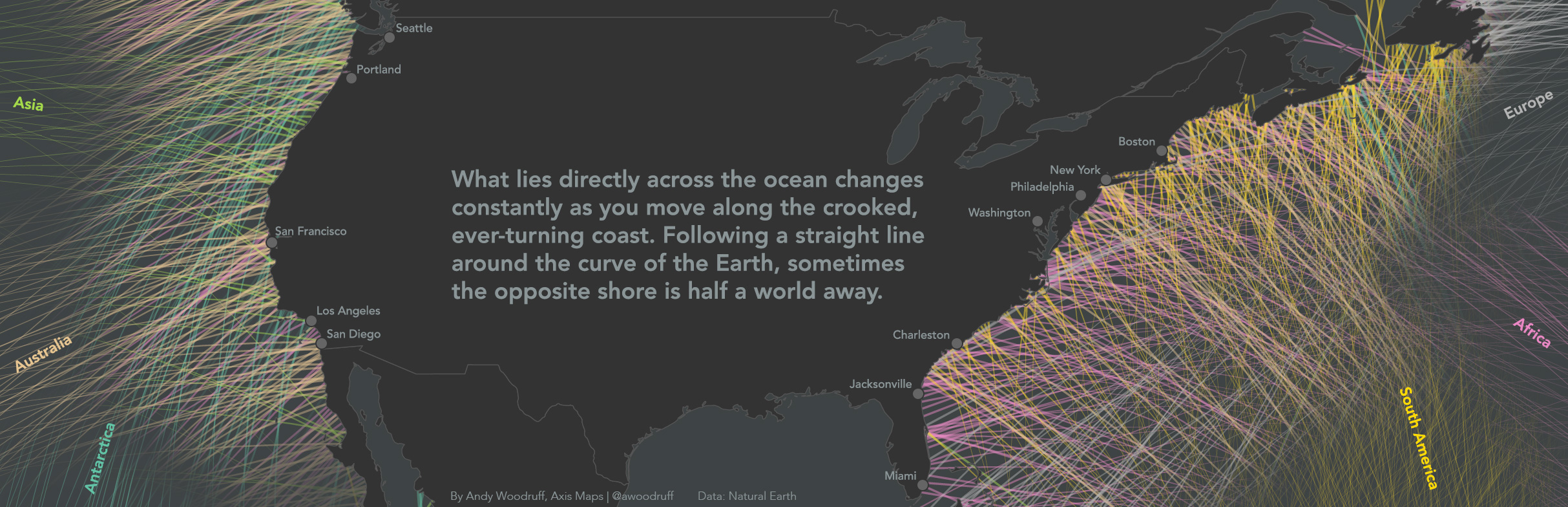
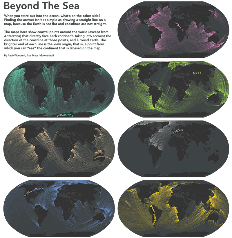
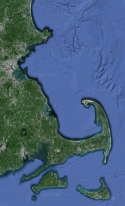
In the northern reaches of Newfoundland, near the town of St. Anthony, is the Fox Point Lighthouse. I’ve never been there, but I know it has one of the most impressive ocean views in the world. If you face perpendicular to the right bit of rocky coastline there and gaze straight across the ocean, your mind’s eye peering well beyond the horizon, you can see all the way to Australia.
What’s really across the ocean from you when you look straight out? It’s not always the place you think.

I’m inspired by a map done a couple of years ago by Eric Odenheimer and some follow-ups by Weiyi Cai and Laris Karklis of the Washington Post. Those maps are colorful, handy guides to countries of equivalent latitude across the oceans. It’s easy to forget, for example, that much of Europe is well north of the United States east coast. But they’re not exactly maps of what’s across the ocean from you, at least not directly across from you. To think of east or west as “straight” across is, perhaps, one of those effects of the map projections we see every day.
The latitude maps got me interested in answering the question more strictly: standing on a given point and facing perpendicular to the coast, if you went straight ahead, never turning, where would you end up? There are two reasons why following a line of latitude won’t answer the question.
1. Coastlines are crooked and wacky.
2. The earth is round.
With that in mind, here are some maps showing the points from which you can “see” each of the continents.
Coastline angle
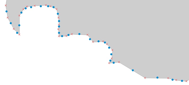
Coastlines face all different directions, bending and turning constantly. The “East coast” isn’t a straight north-south line facing directly east. Just look at the state where I live, which has coastline facing literally all directions.
Taking “across the ocean” to mean directly across, perpendicular to the coast, then what’s across the ocean depends on where you’re standing! To get a rough idea of what direction the world’s coastlines face, I’m calculating the angle between every pair of adjacent coastal vertices in medium scale Natural Earth data, then placing a point in between them and measuring the view from there based on that angle.
The much-maligned Mercator projection comes in handy here. Those angle calculations were made using projected coordinates because the conformal Mercator projection preserves the thing I’m interested in: local angles!
Straight lines on a round object
The second point is trickier to imagine thanks to common rectangular maps and the way latitude itself is defined. If you can detach the concept of “direction” from the concept of east and west, and look at globes and other map projections, it’s easy enough to picture. The shortest, straightest line on a sphere (let’s call the Earth a sphere even though it technically isn’t) is a great circle arc, not something like a line of latitude.
What we often think of as “straight” is a path following a rhumb line, a line of constant bearing. Wikipedia succinctly describes how such a “straight” line actually turns, in contrast to a great circle.
If one were to drive a car along a great circle one would hold the steering wheel fixed, but to follow a rhumb line one would have to turn the wheel, turning it more sharply as the poles are approached.
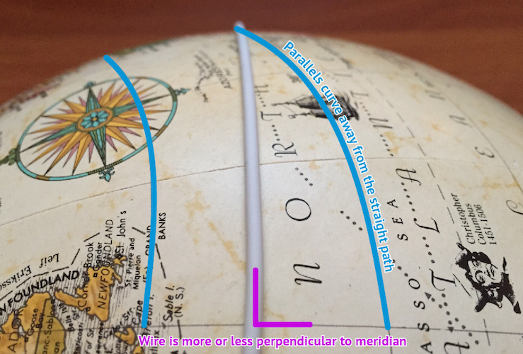
A typical classroom demonstration of great circles is to pull a piece of string taut on the surface of a globe between two points, and note how the string arcs across lines of latitude, changing its bearing the whole way. Try this specific case to drive home how the spherical “straight” differs from “straight” as we’ve defined compass directions: find a line of longitude on the globe, then a spot along that line somewhere away from the equator. Bring the globe to your eye and place the string perpendicular to the meridian, in between two latitude lines. Line up your view with the string and you can see that even though it starts out going due east or west, as it continues directly ahead the “straight” east/west parallels curve away from it.
So if we want to know what’s truly straight across the ocean from a given coastline point, we need to see what direction the coast faces at that point, then draw a great circle in that direction and see what it runs into.
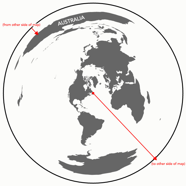
As for flat maps, certain map projections provide an accurate view of directions. The azimuthal equidistant projection, for example, preserves correct direction (and distance) from the center point of the map. A straight line from the center of the map is a straight line in real life. Here’s the Newfoundland-to-Australia example from earlier:
Such a map, in the end, is how I’m figuring out beach views: center that projection on each point, then draw a straight line in the correct direction until it hits land.
Conclusion
I’m not entirely certain that I have all the math right, but I think it’s at least close. Even we cartographers sometimes have a shaky grasp of map projections and spherical geometry.
But who has time for correct math? I’ve got to start training for the straight-line swim from the number one beach in my life—30th Street in Ocean City, New Jersey—to Brazil.
| 50 comments
By Andy Woodruff on 8 March 2016
In a hundred years, no one will remember our work. Strike that, make it about five years. Digital, web-based work can break or disappear in an instant. I’ve certainly done some things which are now gone forever.
Anyway, one broken thing was the crazy Ohio piano map I made nearly seven years ago, in which counties of Ohio were represented by the sounds of piano keys, and data became music of sorts. Actually, it’s not entirely broken; the sounds and most interactions work, just with a big, persistent gray error because Google Maps for Flash is no longer a thing.
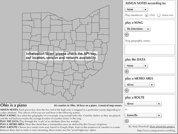
Professor Robert Roth insists that this ridiculous map is vital to the teaching of cartography, and who am I to stand in the way of education? So I dug up the old laptop that had the only copy of the Flash map’s source code and set about recreating the map in more modern HTML and JavaScript. It doesn’t have everything the old map has, but hey, it works. Bonus: now the code can actually be seen, on GitHub.
It definitely does not work on mobile devices because playing audio elements on mobile is complicated and I don’t care enough, but if you’re on a desktop computer, here you go. Don’t touch this if you’re in a library or something without headphones. You’ll be embarrassed.
| 4 comments
By Andy Woodruff on 12 February 2016
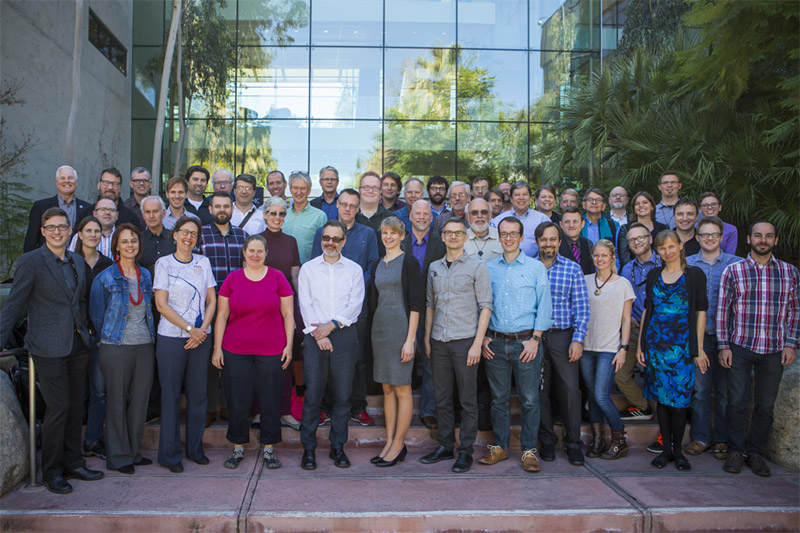
In the official Cartographic Summit photo above, I’m the robot on the right edge who doesn’t know how to stand like a normal human. I’ve just returned from this unusual event, which was part traditional conference and part unconference, with people in attendance only by invitation. I didn’t know what to expect, but figured a few days with friends new and old in sunny Redlands, California in February couldn’t hurt.
The point seemed to be to discuss and identify key areas of focus and/or research for cartography in the near future. A handful of excellent speakers got us going, but much of the main event revolved around small discussion groups which met to talk about challenges and ideas along certain themes and keywords, subsequently summarizing the discussions for everyone else to hear. Surprisingly these were very engaging, forward-facing, and dare I say somewhat fruitful. Usually traditional cartographers talking about Cartography Future only want to fix what’s wrong with Cartography Present, and blame it on those who don’t know Cartography Past. Less so this time.
Altogether it was pretty interesting, and I was mostly pleased with what transpired. Below is a short list of words and phrases that stuck in my mind. Some are good and some are bad. A few are my own thoughts but most paraphrase what I heard. Many are open questions, but that’s okay. Part of the idea here was to develop agendas. Do check the #cartosummit hashtag on Twitter for many more reports, and watch for audio and slide recordings to be posted.
AUDIENCE. We were traditionally taught to understand our audience before designing a map, but we may be falling behind these days. We don’t always think enough about how our maps will be used in the wide variety of possible media and environments. And the internet being the internet, sometimes a map escapes our control and goes far beyond its intended audience. Related to this, there was some discussion about making better use of tracking and analytics, and making such capability easier in our tools.
BIG DATA, SMALL MAPPING. Big data isn’t entirely new. People mapped massive data sets ages ago, but in those days it was usually done by large organizations with lots of people and resources. These days the entire job often falls to an individual. What are the consequences of this, and how can we as cartographers address such a challenge?
BLACKLIST. Although this event was hosted by Esri and organized in part by Esri people, it was in large part an ICA event and Esri attendance was very limited. But for an intellectual meeting about the future of cartography, there was a conspicuous absence of representatives from certain major players in mapping—companies that are in some degree of competition with Esri. Rumor was that inviting them was denied by the Esri powers that be. I’ll take it back if that’s not true, but if it is, it sours the experience a bit for me.
CLARIFY. The best-remembered word from the inimitable Nigel Holmes this week. It’s understood that a vital role of a cartographer is to find and make clear some aspect of data, not simply throw all the data at everyone. This was especially emphasized in discussions of mapping “big data.”
COMPUTATION. What is the role of computation in cartography? It’s more than the hard work of crunching through data. We should embrace it as part of the design process, not as something that detracts from it. If there is one thing I would stress to modern big-C Cartographers, it’s this.
DIVERSITY. This was definitely a white male, people-like-me meeting. At the very least, clearly in a group of 50, there ought to be more than 11 women. Diversity is something we need to improve in the cartography community in general, not only in the sense of gender, ethnicity, etc., but also in things like educational and economic background. Most people who actually work with maps don’t come from the world of advanced geo-degrees that we tend to deal with. (Side note: we’re working on some plans for this at NACIS.)
ELITISM. I appreciate an effort to bring together top minds in cartography (plus a few of us internet loudmouths) and the huge benefits of smaller group discussions, but in a field as collegial and small as ours it leaves many people spurned and furthers an elitist reputation we have among some segments. A few poorly contextualized tweets make it look like we’ve only gathered to continue picking on the new kids. I really don’t know how to be limited, representative, and diplomatic all at the same time, but there is probably some ground to gain here.
EXCITEMENT. Cartographers are in an enviable position to make other people excited about their own domains. The smartest people in the world can have their minds blown by seeing something they’ve studied for years mapped for the first time. We can do good for other fields at the same time as our own.
FAST AND GOOD ENOUGH. Let’s recognize that many modern map users and map makers want to accomplish something in mere seconds, not through a slow series of decisions. We can do people a great service by getting as far as possible with smart, automated decisions. The result will never be perfect, but it’s worthwhile.
MAP LITERACY. How can we better teach ordinary map readers to look at maps critically, to understand their limitations and biases rather than taking everything as unqualified truth? There was, at least, some sense that people are getting better at recognizing good cartography, which is nice. I’d rather help people become better map readers than worry about a proliferation of bad maps.
SKIPPING. Yeah, so I ditched most of the third day to go to Joshua Tree National Park with [names redacted to protect professional reputations] instead.

| 4 comments
By Andy Woodruff on 1 February 2016
Hello friends.
It has become apparent that you are all terrible at being pedestrians. I feel confident saying that despite some good eggs and battle-tested walkers such as New Yorkers, most Americans are obliviously selfish, inconsiderate users of sidewalk space. It’s true even in a city like mine, where a large chunk of people commute on foot.
Perhaps it’s because cars are the default mode of transportation in this country, and once on foot outside a car, people view everything as some kind of personal leisure space, not a system that still requires a certain amount of order, competition, and cooperation.
Whatever the cause, the point is, my friends, that you are always getting in the damn way of other people who are trying to get places. I know you don’t mean to, but you do.
But I’m here to help. Here, using some handy diagrams, is a short guide to not being a jerk and getting the hell out of the way.
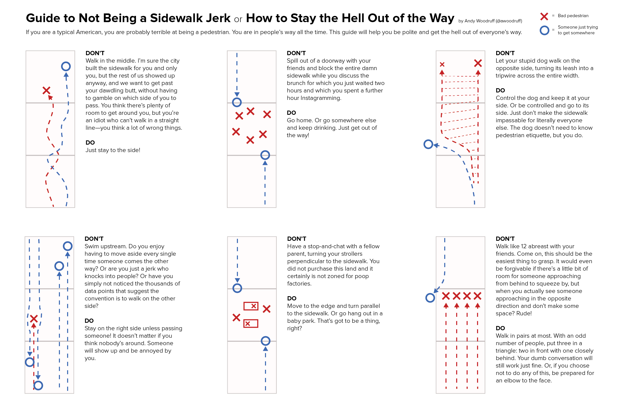
You’re welcome. Now get out of the way.
| 6 comments
By Andy Woodruff on 5 January 2016
Sure, whatever, a 2015 retrospective. It’s no best-of list, reflection on the mapping industry, nor quantified-self infographic. I just thought a bit about what was important in my year—mostly, themes of friends, family, health, and beer—and sketched a few things, in map form of course. So yeah, it’s personal stuff that nobody else will care about, but hey, it was a nice exercise.
1. The Setting Sun
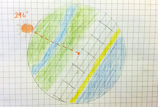
My grandmother, who would turn 96 today, passed away in March. We miss her dearly, of course, but there’s a comfort in seeing her honored in the sky every single day. Grandma appreciated a sunset like nobody else, and never missed a chance to greet “Mr. Moon” at night. During family vacations to the Jersey Shore each summer she led us all in the daily habit of gathering on the porch to watch the sun set over the marshes. Lately those shore vacations have coincided with my grandparents’ anniversary, so here in this map is the azimuth of sunset over Ocean City, New Jersey on July 25, 2015 when, despite her absence, the family marked their 73 happy years of marriage.
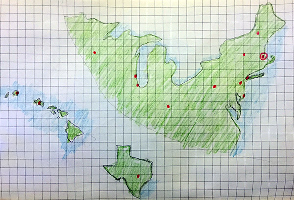
2. The Places You’ll Go, The People You’ll See
This is a map of every place I visited long enough to stay at least a night in 2015. It wasn’t much of a year for travel but it did involve more out-of-town conferences than usual (NACIS, State of the Map US, even AAG a bit), and that brings extra appreciation of the people in my professional community. I’ve been in professional cartography for ten years now, and it’s such a tight-knit, friendly world that a business trip is never really business—it’s a gathering of friends. Special thanks to NACIS, the conference and society I’ve been part of for a decade, where I’ve learned a ton and formed many a lasting close friendship.
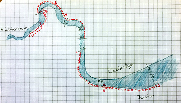
3. Usual Running Routes
This is a pretty new habit. I used to scoff a bit at runners but now wonder why I haven’t been doing it for years, given that I live adjacent to miles and miles of paths along the Charles River. I’m certainly running no marathons, but the ability to go 3 or 4 miles on a regular basis feels great when a few short months ago even 500 feet probably would have wiped me out. Plus, you know, eventually you reach an age where it becomes necessary to worry about the diet of beer and cheese you picked up back in Wisconsin.
4. Where Everybody Knows Your Name
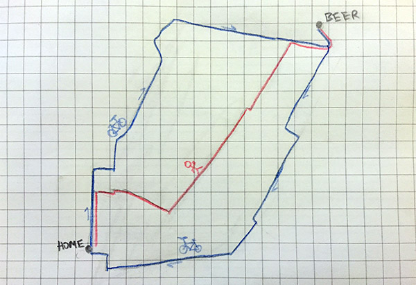
I tweet about Parlor Sports a lot. This makes me sound like a sad alcoholic, probably, but it’s hard to stress enough how much this place is like a second home and its people a second family. Whether it’s to watch one of Boston’s illustrious sports teams (Go Pats), or to meet Mike and Jake and Ryan and Sydney for #geobeers, or simply to say hi to James or Garvey or Jon or Nikki behind the bar, it’s amazing to go to a place where indeed everybody knows your name. So here are my routes to and from the bar, depending on mode of transportation.
Mappy 2016!
| Comments Off on 2015
By Andy Woodruff on 16 November 2015
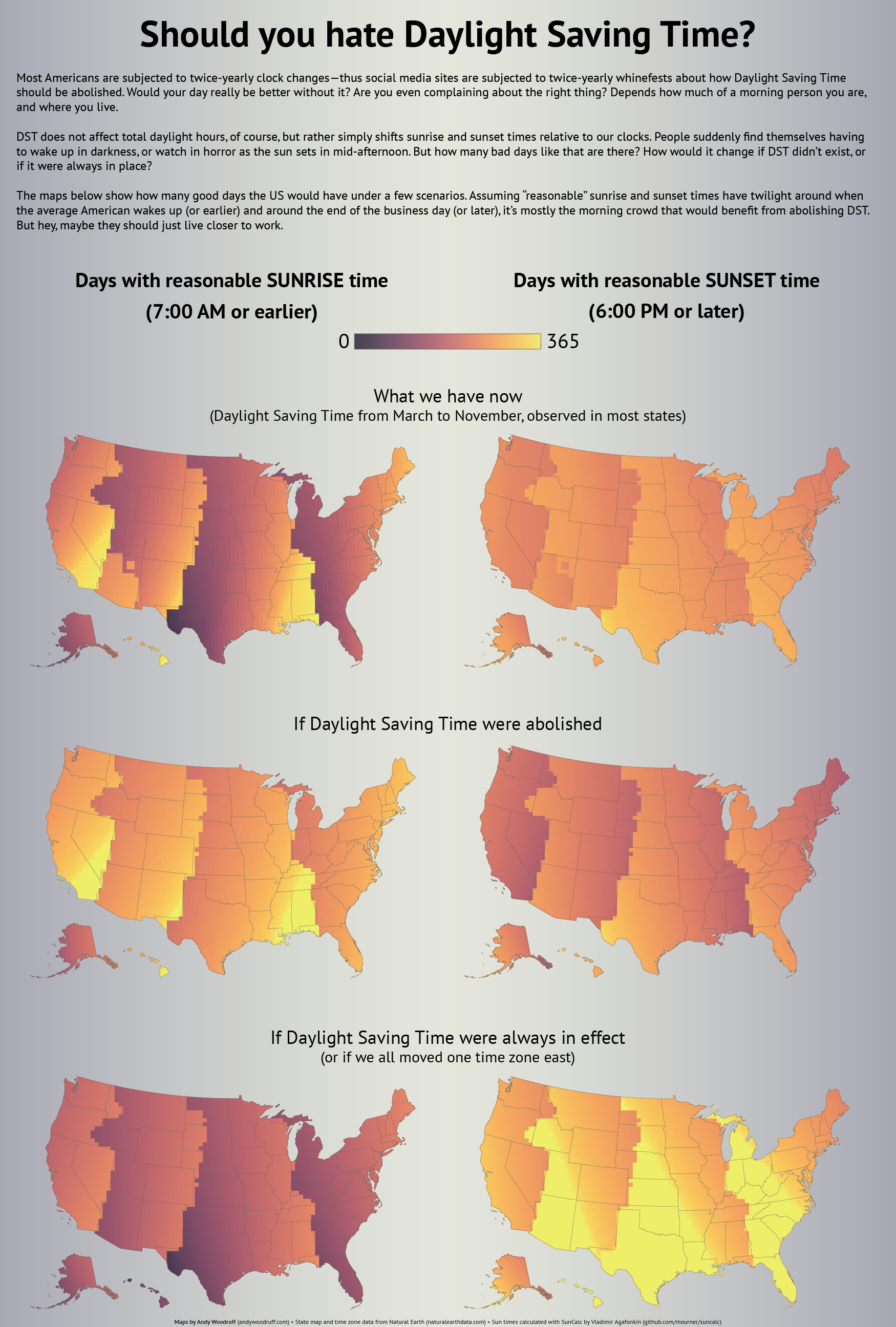
Update: a newer version of this little project helps you make your complaints about daylight saving time—whether they’re for or against it—with clearer messages about whether keeping DST, abolishing it, or making it permanent would be best for your daylight preferences. Give it a whirl over at Observable.
tl;dr version: just scroll down and play with the map.
If you’re on Facebook or Twitter or really are any person in America with friends who say things, you hear it twice a year, in March and November: “LIFE IS THE WORST WHY DO WE HAVE TO CHANGE THE CLOCKS WE SHOULD GET RID OF DAYLIGHT SAVINGS [sic] TIME!!!!!”. Maybe you’re even one of the people saying it.
Usually the whining is short-term shock at the sudden change in the timing of day and night, not a reasoned assessment of what it means for the timing of daylight over the whole year. People often don’t even know what they’re complaining about: they’ll rail against “daylight saving time” even if it’s the early sunsets of standard time that they hate. For the record I’m no DST hater, because my morning commute is about 5 seconds (no pants required) so I never need to wake up before the sun, and I live in a place where the sun sets at 4:11 in the damn afternoon in winter so I’d love to push that back an hour.
There is a cool interactive piece about this by Keith Collins on Quartz charting how keeping or abolishing DST would affect your daylight hours. In New York, you’d have to wake up at 4:30 AM or go to bed absurdly early in order for DST not to increase daylight in your waking hours.
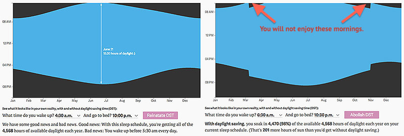
If you wake up at 6:30 like a normal human (note: “normal” still sucks), DST makes you wake up in darkness for a handful of extra days in spring and fall. The daylight is regained in the evening, of course, but I’ll grant that waking up before the sun is miserable.
It’s noted on that page that the chart’s data “assume you are located in New York, but differences are minimal across the contiguous 48 states,” but I’m a geographer and must always disagree with any and all spatial claims, by anyone. I live in the same time zone where I grew up, but the sunrise/set times are almost an hour different between the two places.
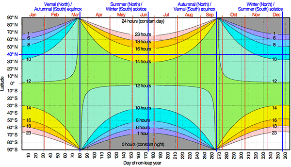
Total daylight is a function of latitude and time of year, as seen in this plot from Wikipedia:
Latitude thus affects how early or late the sun rises and sets, but what the clock says depends on a location’s longitude within its time zone. The farther east it is, the earlier the sun will rise and set. Considering all this, I want to map sunrise and sunset times in the United States and see how they are affected by daylight saving time. I’ve done so by using a little bit of GIS and the super handy SunCalc JavaScript library by Vladimir Agafonkin.
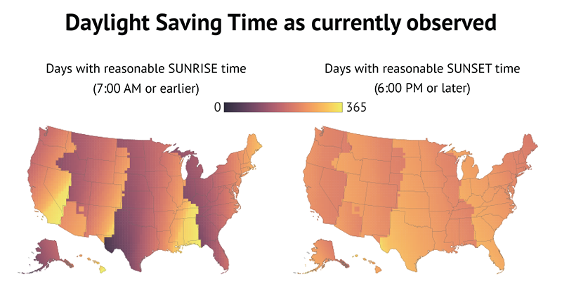
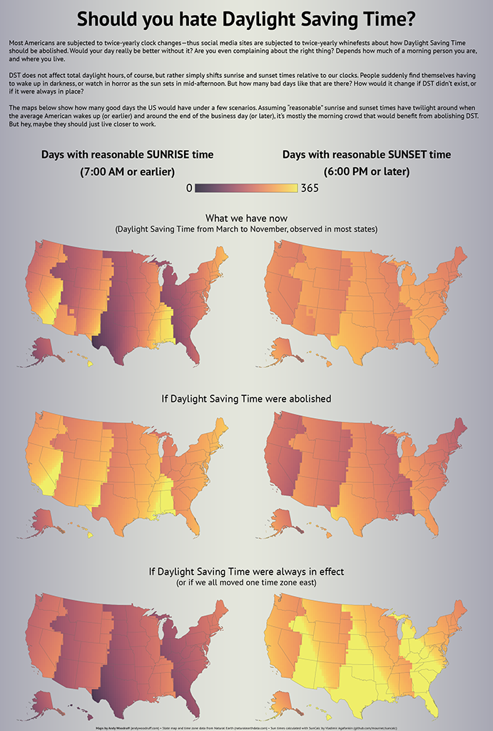
Let’s map how many days of the year have reasonable sunrise and sunset times with and without daylight saving time. I define “reasonable” times as 7 AM and 6 PM. That’s kind of arbitrary, but assuming roughly half an hour of twilight, it at least puts some light in the sky around the time the average American wakes up (6:30ish based on some cursory poking around) and at the end of the business day. But you can define them differently. Explore the coarsely gridded map below and see the geography of sunrise and sunset with and without daylight saving time.
To summarize, these are the scenarios using my preferred times. First, the state of things as they now exist:
And here’s what everyone apparently wants, death to daylight saving time:
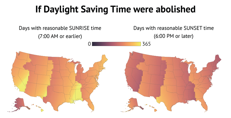
It looks like an improvement, right? The sunset map doesn’t change a whole lot, while vast areas seem to get a lot more days with morning sun. So yes, maybe you could cut your coffee budget if you live on the western side of your time zone. Just remember you’d be giving up those wonderful summer evenings.
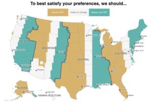
Now let’s go bonkers and implement daylight saving time all year long. Or, for the same effect, we could get rid of it but have everyone shift their time zone one to the east:
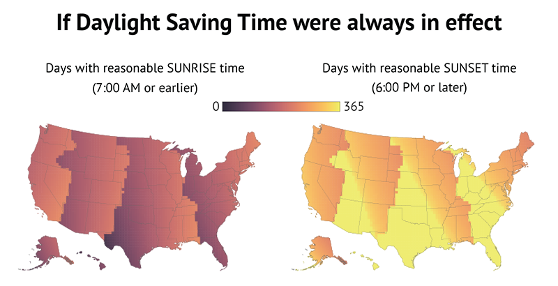
Admittedly the sunrise map looks bleak. But look how much brighter that sunset map gets. I mean, just look at it!
If you want consistent morning daylight, you should be as far southeast in your time zone as possible. I recommend the Big Island of Hawaii. If, like me, you’re all about evening sun, hop the border to the southwest part of the next time zone. But remember that’s for consistency, not total daylight. The farther north you go, the longer days will be in the summer—but the shorter they’ll be in winter.
Anyway, here’s all that in poster form for some reason.
| 83 comments