
Sparkmaps?
I’m catching up on some of the reading I meant to do a couple of years ago, when I was a geography/cartography student, beginning with the original intersection of urban geography, planning, and mental maps: Kevin Lynch’s The Image of the City (1960). The subject of the book aside, something cool here is what’s going on in the margins.
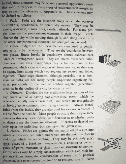
Lynch made use of many sketches and diagrams in the margins of the book. These are small, about an inch or less, and appear beside the section of text with which they are associated. They don’t break up the text, and the text doesn’t even include any references to them; they’re just right there next to the words you’re reading. Above, for example, are the paragraphs defining paths, edges, districts, and nodes, which along with landmarks (next page) are Lynch’s elements of the city image. Next to each paragraph is a little illustration of the concept described within. I really like this idea. Naturally, most interesting to me are the occasions where the margin diagrams are actually maps of real places.
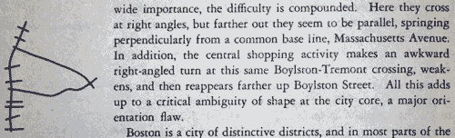
Boston
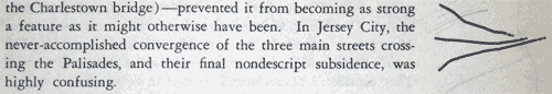
Jersey City
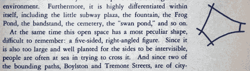
Tiny, non-intrusive supplemental maps bring to mind the Tufte-championed sparklines, hence the post title. (I don’t care if “spark map” refers to something else; I make my own rules around here.) Most maps, unless they are linear and horizontal, are substantially more difficult to insert directly into text than is the archetypical sparkline, of course, but I think the spirit is at least similar. As a sparkline provides at a glance a reasonably clear picture of numerical data, so can a small map provide context and clarify otherwise confusing or vague text. For example, in the image below Lynch mentions Boston Common’s “peculiar shape, difficult to remember: a five-sided, right-angled figure.” Peculiar and difficult? What better way to give that sentence meaning than to include a little sketch map right beside the text, toward which your eyes will be moving anyway?
(By the way, he was talking about the shape being confusing to residents. If there is one American city whose description can be aided by small supplemental maps, it’s Boston. Then again, you’d think that in a city where a “square” bears no resemblance to that shape, the residents would have developed an understanding of irregular polygons with more than four sides.)
The interactive interweb equivalent, it would seem, might be some map—Google or what have you—embedded in a small pop-up revealed on mouse over of the text. I’m sure I’ve seen something like this, but handy examples escape me at the moment. This suggestion, however, can surely be much less effective than the old-fashioned marginalia approach, because any automated map is likely to contain too much detail for the purpose and because the effort of interaction can easily break the narrative just as well as a big image that breaks up the text. Other interactive suggestions and examples are welcome, but as far as I’m concerned these little maps in the margins are as good an idea on the web as they are in books.
Tagged books, interesting maps, sparklines
2 Comments