
You are here, but do you know where “here” is?
Bear with me as I relive some grad school memories (but not the fun ones) for a moment…
Last year two of my University of Wisconsin colleagues (Jamon Van Den Hoek and Eve McGlynn) and I did a small research project to present at the Annual Meeting of the Association of American Geographers in San Francisco. Figuring our Geography Department would reimburse our expenses at a rate proportional to the number of words in the talk’s title, we called it Exploring the Relationship between Navigational Tools and Geographic Context in Interactive and Static Maps. The gist of our work was this question: how does a map user’s knowledge of a given place differ based on the use of an online, interactive map versus a static, printed map of the same design?
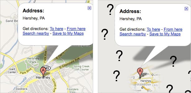
We supposed that the user of a basic interactive map (with panning and zooming) suffers navigational trauma: simply put, getting lost due to jumping from place to place and only viewing a portion of the map at any given time. The user of a static map, in contrast, is able—and sometimes forced—to see the entire map with a constant level of detail and see the context of any particular point of interest. We were interested in seeing how well people knew the geographic context of places on the map, that is, the surroundings of specific places or the overall characteristics of the mapped area. Because of interactivity, the user of an online map doesn’t necessarily need to view things in context, and so we figured that user would have a poorer understanding of their context. Jamon had a story to exemplify this: by searching Google Maps he’d recently been able to travel to Hershey, Pennsylvania without ever knowing where it is within the state.
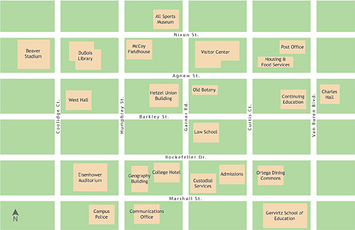
Jamon and Eve were my fellow student workers on the UW online campus map, and at first we were interested in comparing the printed campus map (with which we were also very familiar) with the online map, which tries to maintain the same look as the print map. Using those maps would not prove to be feasible, but we stuck with the campus map idea and generated a fake one. We made two versions: a printed 11×17-inch map and a web-based interactive map that allowed panning, zooming, and searching. (An image of the map is above.) We then gathered subjects for a short experiment. Subjects were presented with either the static or interactive map and given time to locate some specified landmarks. The maps were then removed and subjects were asked questions about the context of those landmarks. After that, a similar process was repeated with the other type of map.
We asked recall questions to assess knowledge of the following:
- Map periphery (“What is the farthest north building?”)
- Relative linear distance (Is Building C two times farther from Building A than Building B is, or four times farther?”)
- Street network distance (“How many blocks are between Street A and Street B?”)
- Overall map context (“Which quadrant of the map has the fewest buildings?”)
- Overall extent (“Is the campus longer east-west or north-south?”)
- “Medial” features (“Name a building between Building A and Building B.”)

Above is a probably confusing scatter plot of accuracy results, showing the number of correct answers in each set of questions (i.e. for both the paper and interactive map) for each subject. For the blue points, the horizontal axis represents the paper map and the vertical axis represents the interactive map. For the red points it’s the other way around. Larger circles indicate multiple observations falling on the same coordinates. Based on our hypothesis, we might expect to see more blue toward the lower right and more red toward the upper left. Although in the first question set the paper map fared better than the interactive map, most other accuracy differences turned out to be insignificant.
To conclude by skipping a lot of boring details, assumptions, and caveats, as we might have expected with a small project that attempted to tackle a broad issue, we learned a few things, but more questions were raised than answered. Ideally this line of inquiry would proceed thus in the future:
- Perform tests with realistic—if not real-world—maps and navigation tasks to get more meaningful results.
- Is there a problem with geographic context knowledge due to interactive map design?
- If so, how can we address the problem through map and interface design?
After spitting out such academic mumbo jumbo, I think we Wisconsin cartographers are proud to always ask the question: so what? What does this mean for actually making maps? Hence number 3 above. Fortunately, because this is a blog and not an academic journal, I can jump past the more scholarly steps, and in the coming days I will post about some different methods of interactive map navigation and how they might affect the issue at hand here (among other practical considerations). Stay tuned!
Tagged Academic, interactive maps
2 Comments