Hello. My name is Andy. I live in the Boston, Massachusetts area and I make maps. I'm available for hire—get in touch if you need a map!
 Formerly with Axis Maps
awoodruff@gmail.com
Leventhal Map Center Designer In Residence
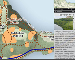
Maps related to "urban atlases" made during my time as Designer-in-Residence with the Leventhal Map and Education Center
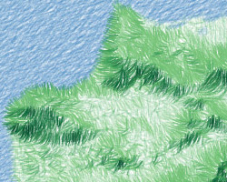
White Mountains "National Park" map
A map of the White Mountains in the style of US National Parks visitor maps
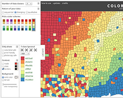
A public health atlas of California offering deep exploration of numerous health indicators and/or custom scores, at many levels of geography.
What's really across the ocean when you look straight out? Straight lines on a round world don't always go where you might expect.
A web map tool for generating, styling, and downloading elevation contours for anywhere in the world.
Eruptions, Earthquakes, & Emissions
An animated map of 250K earthquakes and volcanic eruptions since 1960, for the Smithsonian Museum of Natural History.
Animated, interactive map of uptake in rotavirus vaccines in the United States, from millions of weekly data points.
An ongoing collection and blog of occasional cartographic looks at life and land in the Boston area.
Global map of water/air quality, contaminated sites, pollution-linked deaths, and user-reported stories.
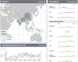
East India Company Visualization
Interactive maps and charts tell the history of commodities imported and exported by the East India Company.
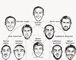
Interactive charts for Kirk Goldsberry's Grantland article on top NBA shooters and scorers.
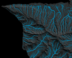
More experiments in canvas-based terrain mapping, finding and animating hypothetical drainage.
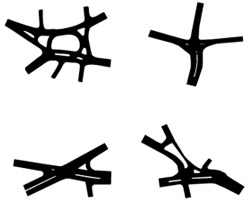
An attempt at hachure maps went off the rails but ended up being kind of pretty.
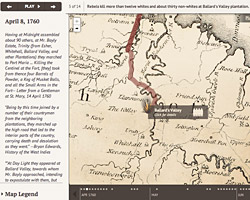
Animated interactive map of the slave rebellion in Jamaica of 1760–1761.
More
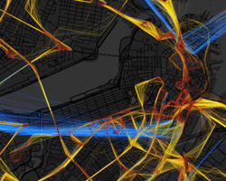
Bus locations and speeds in the Boston area over time: live maps and 24 hour composites.
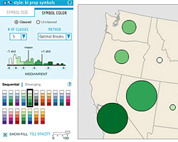
Cynthia Brewer's work on color schemes for maps. We at Axis Maps built and maintain the current version of the tool.
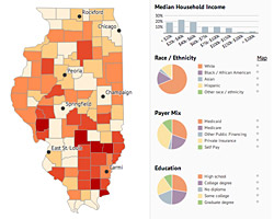
Dashboard for exploring, comparing, and visualizing various California health estimates.
More
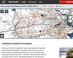
An interactive site explaining and highlighting natural gas infrastructure problems in Massachusetts.
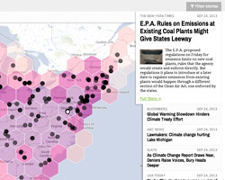
Aggregates news stories related to climate change in the US, alongside some pertinent geographic data.
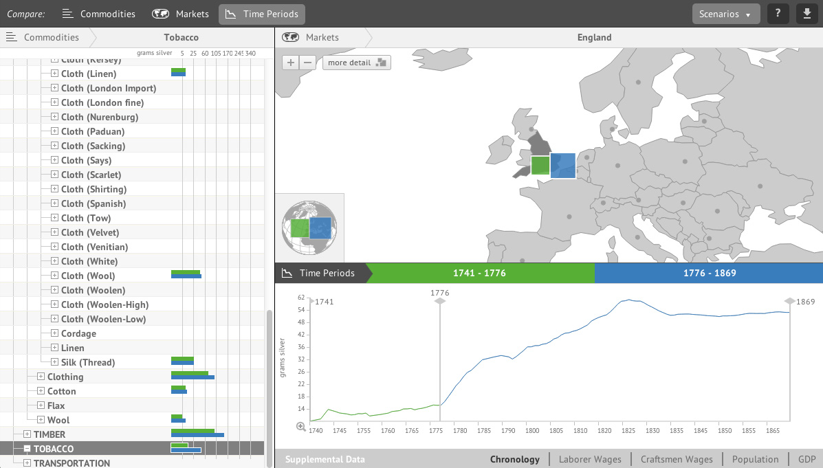
A visualization of prices for 400 commodities across 245 different markets and some 1000 years of history.
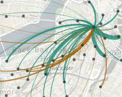
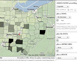
View trip patterns to and from stations in Boston's Hubway bicycle-sharing program based on a variety of filters.
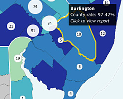
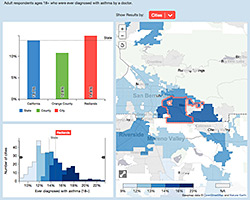
Interactive map showig quality-of-health-care data across various measures and scales in the US.

Five map features I've done for the wonderful Ideas section of the Boston Sunday Globe.
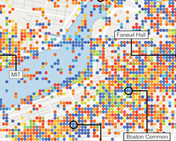
Dominant hues of some 50,000 geotagged photos in the central Boston area during summer months.
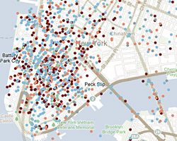
NY Times September 11 Map
User-shared memories of 9/11. Map is defunct now, but hey, gotta show off my one NYT collaboration!
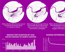
A few infographics to pluck out some interesting bits of information from the Hubway bike-share data.
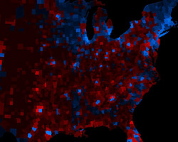
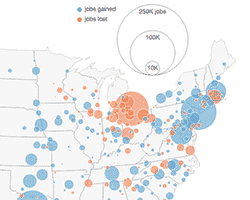
My first experiment with what we later called a "value-by-alpha" map, as an alternative to election cartograms.
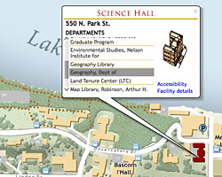
UW Online Campus Map
A prior version of the University of Wisconsin-Madison's web map. It's gone now, but I totally worked on it.
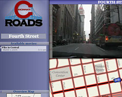
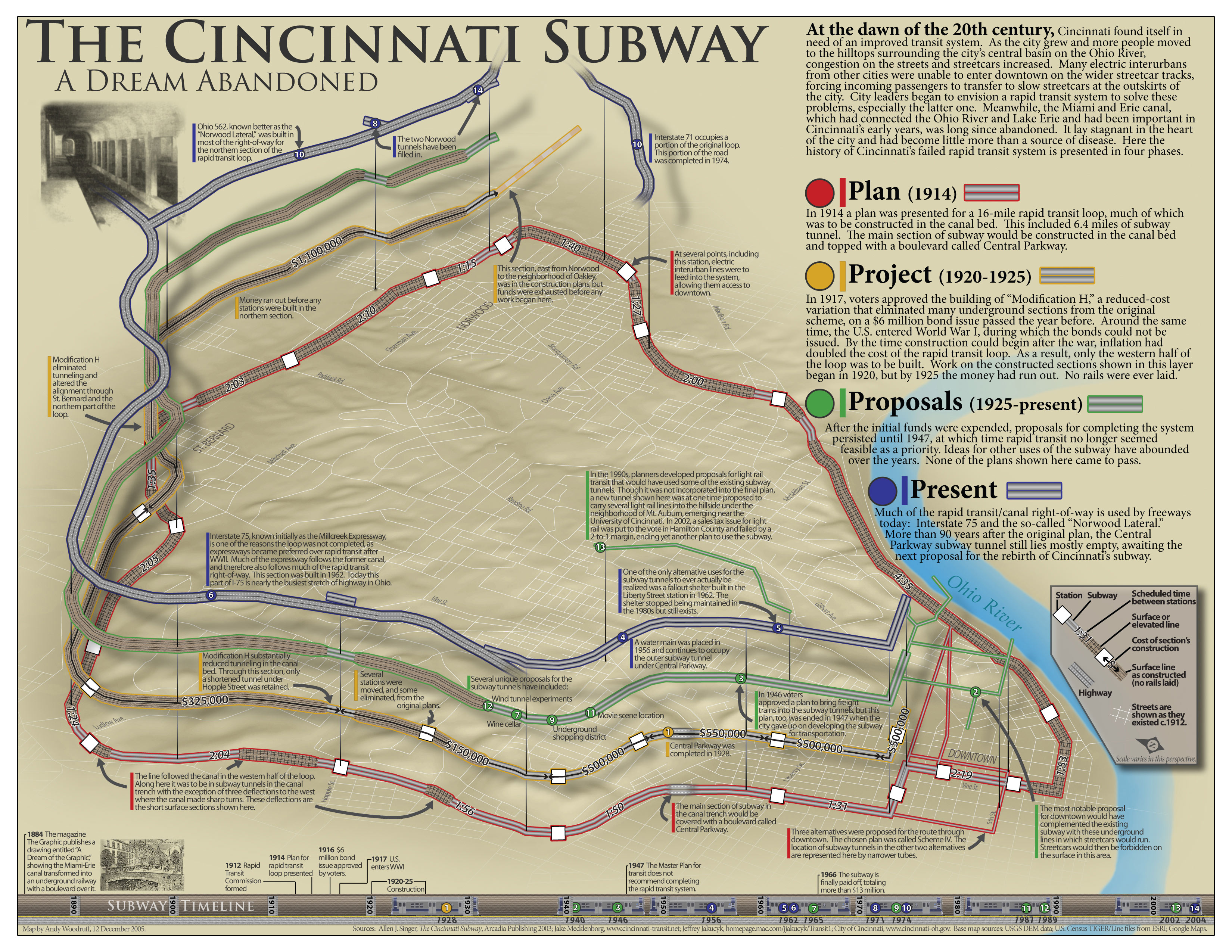
From the days before Google Maps: an interactive map viewer for dash-cam videos of Cincinnati streets.