
Magazine cover subway map awesome
Still being enamored of subway maps, and either out of convenience or some sort of local bias that of the Boston system in particular (see for instance my pipe cleaner map or the “Tea Stop” menu), I nearly wet myself when I saw this magazine cover on newsstands.

The cover for Boston magazine’s annual Best of Boston issue is the Boston subway (“T”) map twisted to spell “the Best of Boston 2009,” with each line representing a category of the awards, and some of the stations labeled as subcategories, while still resembling the approximate geography of the subway system and the form of the official MBTA map. The “map” was done by designer Alex Camlin. See his portfolio entry, where he notes that this is actually modified a bit from the design he submitted. The Best Of article keeps up the theme, using a design incorporating elements of a fare ticket.
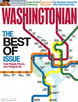
Inside the magazine, it is noted that Washingtonian magazine also used a subway map for the cover of its “best of” issue this summer (unfortunately hitting newsstands the same week as the deadly collision in June). This one maintains an unaltered form of the official Metro map. I can’t seem to find any larger images than the one below, so I don’t know what the labels say. Are they also award categories?
Anyway, awesome. Just sayin’.
Tagged Boston, metro maps, Washington
2 Comments