
Typographic maps of Boston and Chicago
Well. There’s nothing like a 20-month side project.

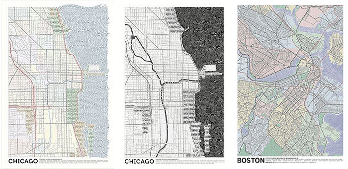
We at Axis Maps are presenting a couple of typographic maps—that is, maps made entirely of typography—that we’ve slowly been working on for a while. One is a map of the central Boston area, and the other (other two, actually) is a map of central Chicago. Let me mention now, because I am a greedy, greedy person, that prints of each are available for purchase. See more detailed images and information at http://typographic.axismaps.com.
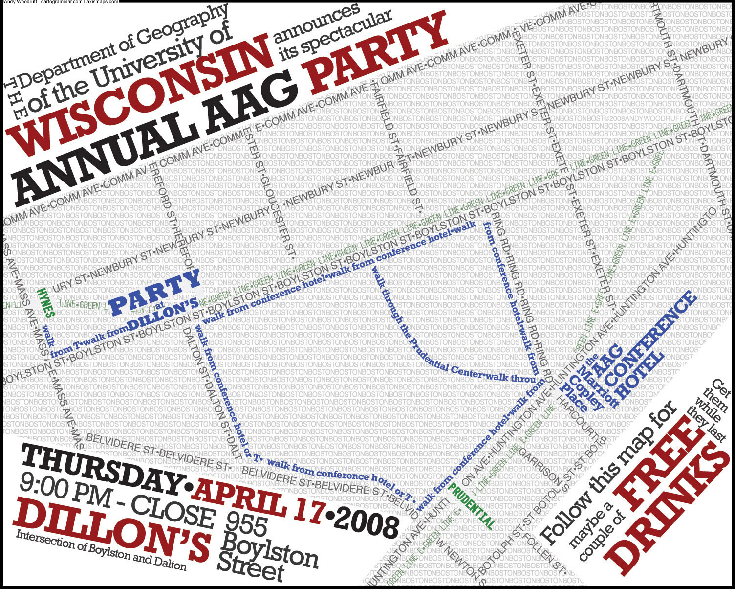
A few people out there may remember that I dig typographic maps, having written two posts on the topic in the past (one | two). In fact, the first of those was my first blog post, apart from the obligatory “OMG WTF I have a blog now LOL” post. This project has its origin in the map I presented there. Having been tasked with producing a small flier for a party during a geography conference in Boston, I produced a typographic map showing the way from the conference venue to the party venue. About five months later I found myself living in the Boston area, and not long after that I decided it would be fun to expand the idea to a larger part of the city.
I presented my progress (above) to my Axis Maps partners a few weeks later. Ben Sheesley and Mark Harrower liked the idea enough to establish a version for Chicago, a city to which they’re both attached in one way or another. Ben led the charge on that one, and we both picked at our respective maps for well over a year and half, until finally with a tear we launched them into the wild today.
Our maps don’t quite have the same flair that you might see in other typography maps; instead, with the exception of a couple of things like Ben’s Lake Michigan pattern, we have a fairly conservative, systematically detailed style that amounts to a nice reference map. But one that’s made of type.
We have both spent a ton of time on these maps, which, given that they are done digitally, instills a new respect for hand-made efforts. Nearly every line of text in these maps was laid out manually. And after that, nearly every line was edited manually to create effects such as the appearance of woven streets. It was all done in Illustrator, beginning with images from OpenStreetMap. We traced streets, filled in areas like water and parks, and then revisited every detail. In this process I think we’ve learned a few things that will help us generate maps of some other cities without taking two years to do it.
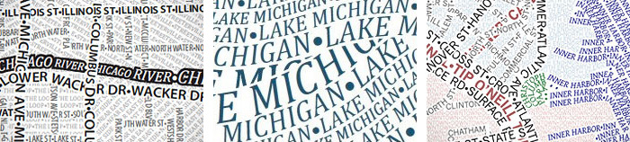
I can’t speak to Ben’s maps as much, but most of the Boston map is based on OpenStreetMap, that is, the road hierarchy, names, and locations of parks large enough to show up. It uses two typefaces (is that the right word?), News Gothic and Gentium, not chosen for any particular reasons but because they seemed to look okay. There are four levels of streets, a single style for each of water and parks, and a background “fill” of neighborhood names in 5 point type using a four-color scheme. The only real cheating is the occasional use of bullets to fill in white space that is too small for letters. Ben’s approach was pretty similar, using Myriad Pro and Cambria. There are styles for three levels of streets, major parks, areas of interest, and water. The black and white version of Chicago isn’t simply a desaturated version of the color map, but rather employs style that end up emphasizing water features over roads, somewhat the opposite of the color map. Where colors distinguish neighborhoods from one another in the other version (and the Boston map), black and white Chicago relies on different orientations of text.
A few Boston people may find their way to this post, so let me confirm that no, mine is not a map of Boston city proper. The city has too strange a shape (consider the Allston-Brighton appendage or disconnected Charlestown and East Boston) and extends too far from downtown to make it feasible for this level of detail. Plus I have to stand up for my side of the river as well as my principles of city definition: some places outside the city are more “city” than some places inside the city. And the Mystic River to the north just looks more interesting than additional land to the south. So apologies if you live in West Roxbury and are disappointed that your house isn’t on this map entitled “Boston,” but sacrifices had to be made. Let me also make a disclaimer about neighborhood boundaries within the city proper. No two sources seem to agree on a lot of these boundaries, so in uncertain areas I have drawn the line somewhere in the middle. They can be equally disagreed upon by all, at least.
BRB, waiting on the stoop for UPS to arrive with my typographic map posters.
(P.S. – Next stops, San Francisco, New York, and Washginton, D.C. Stay tuned!)
Tagged axis maps, Boston, chicago, posters, typography
13 Comments