
Value-by-alpha maps
The latest issue of the The Cartographic Journal (of the British Cartographic Society) contains a paper written by Robert Roth, me, and Zachary Johnson entitled “Value-by-alpha Maps: An Alternative Technique to the Cartogram.” The value-by-alpha map is something I have touched on here several times over the past year and a half (as has Zach on his blog), and about which I spoke at last year’s NACIS conference in Sacramento. With the publication of this paper, it’s high time I explained what it’s all about.
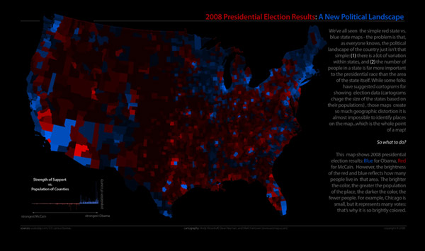
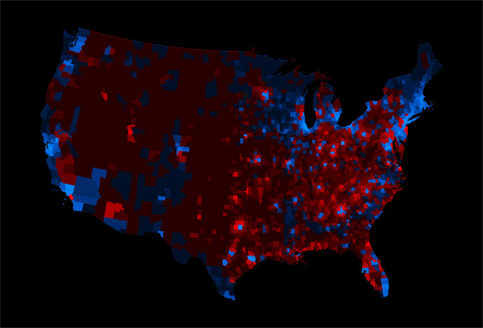
Value-by-alpha maps (hereafter shortened to VBA), like everything noble and good, have their roots in somebody complaining about something on the internet—me, about election cartograms. Seeking an alternative to what I think are ugly and unreadable election results cartograms, I worked with my Axis Maps dudes to create a 2008 U.S. election map that used transparency rather than size to vary the visual impact of map units, thinking that avoiding the distortion of these units into unrecognizable sizes and shapes would make the map easier to read.
Rob Roth, a stellar Ph.D. candidate and shameless county collector at Penn State (studying under The Beard himself, the illustrious Alan MacEachren) became interested in further developing the idea academically and enlisted my Axis Maps partner and radical raw milk zealot Zach Johnson (who wrote his master’s thesis on cartograms) and I to collaborate on the now-published Cartographic Journal article. We were all graduate students at Madison together once upon a time, and we make a good team—striking a perfect balance between study, practice, and chili-eating.
Enough backstory. I’ll summarize at moderate length the idea and what we wrote.
WTF is a value-by-alpha map?
First things first: value-by-alpha is essentially a bivariate choropleth technique that “equalizes” a base map so that the visual weight of a map unit corresponds to some data value. Whereas cartograms accomplish this by varying size, VBA modifies the alpha channel (transparency, basically) of map units overlain on a neutral color background. Thus shapes and sizes are not distorted (except necessarily by the map projection, of course), but the lower-impact units with lower alpha values fade into the background and make for a map that is visually equalized by the data.
Solving Johnny’s Cube
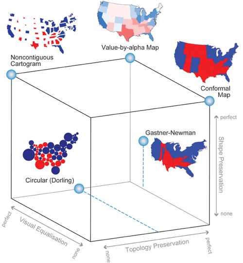
To make a case for the limitations of cartograms, we point to Zach’s graduate work that compares several different types of cartogram designs. Zach developed a typology that describes cartograms in terms of three characteristics: shape preservation, topology preservation, and density equalization (basically a measure of how accurately the area corresponds to the data value; we’ve modified this to visual equalization to include more than just size variation). Depicted as a stylish and highly respectable cube, his typology reveals a back corner that is unattainable for cartograms, as none can be perfect in all three regards. Value-by-alpha, by leaving size and topology alone, allows us to nearly “solve” Johnson’s cube.
VBA works by wordplay
We must note that although creating VBA maps involves modification of transparency, the maps do not in the end symbolize via MacEachren’s visual variable transparency, which is more like a masking of one layer by another that is not aligned to it. Rather it’s two color variables, one of the late Jacques Bertin’s original graphic variables and a later addition—color value and saturation. In the end it is as though each map unit’s color was adjusted in value and saturation. “Value-by-alpha,” then, is an infinitely clever name (chosen by Rob) that refers to both numeric value (as in “value by area,” a term for cartograms) and color value.
Design considerations
On to the practical advice. There are basically three components to consider in the design of VBA maps: the modifying color, the equalizing variable, and the variable of interest.
The modifying color is the color that modifies the original unit color as its alpha value changes, i.e., basically the map’s background color. White or black are the only colors that make much sense here, as anything else will confuse hues and muddle the value and saturation too much. There is some difference in the way white and black affect value and saturation, but they both essentially map an overall “lightness” to the data (just in opposite directions). Black tends to make for a more striking map, I think.
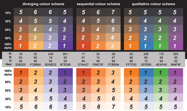
The equalizing variable is the one that is symbolized by alpha and thus visually equalizes the map. First of all, this variable needs to be one of consequence to the variable of interest in order for the visual weighting and VBA altogether to make sense (e.g., counties with more voters are of more consequence to election results). With that out of the way, we recommend classifying the variable into five to seven classes. That number is pushing the limits of what can be visually distinguished, but we are suggesting some compromise for an improvement in aesthetics. To avoid units that are completely invisible, the lowest class shouldn’t have an alpha value of zero, but rather something in the 10–15% vicinity, from there stepping up to 100%. To assist with geographic context, we also suggest adding an outer boundary to the map units taken together.
The variable of interest is the variable being mapped with color and weighted by the equalizing variable. Because the alpha modifications introduce a lot of subtle variations in color, we advise a fairly limited number of data classes (unmodified colors) in this variable, specifically only two or three variants of each hue. For a sequential scheme that generally means two or three classes, and for a diverging scheme it means four to six. As always, ColorBrewer is the place to look for color schemes, a few of which are ideal for avoiding inherent lightness differences in hues that could upset the map’s intended visual hierarchy.
Below are some example color and alpha schemes, taken from ColorBrewer specs. Each is labeled with numbers that correspond to the intended visual hierarchy, where 1 should stand out the most, 2 the next highest in the hierarchy, and so on. Note that several colors may be meant to exist at the same level.
For the faint of heart
Cartograms are good for shock value. They’re an in-your-face radical perspective on a world you thought you knew, and they can really make a point. As a carto-curmudgeon, I remain meta-amazed by the amazement with which cartograms are received. We think that VBA can be a good choice when you want to show similar information but also want to be able to recognize what the hell you’re looking at. So when no shock is required, or it would hinder the intended map-use tasks, perhaps value-by-alpha can be your friend.
Limitations
Let’s be real—even I’m not convinced that VBA is broadly useful. We are proposing it and providing some theoretical support, but it is untested and carries important known limitations. It cannot be a universal replacement for cartograms, and we don’t want to imply that it is.
First, color value and saturation are not the most effective visual variables for encoding numerical data, certainly less so than size, which is what cartograms use. Furthermore they can’t as easily be tied to direct mathematical scaling as cartograms might. What all that means is that we can’t expect users of VBA maps to extract numerical estimations with much success, so the technique is best reserved for big-picture purposes, not precise comparisons.
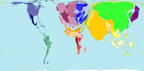
Second, VBA is incapable of an important use of cartograms, which is to emphasize units that are small in area but thematically important, for example some of the European countries in the population cartogram below. VBA can only reduce the visual presence of a map unit, emphasizing the important ones only by diminishing the surroundings. Small geographic units may remain difficult to interpret.
Third, we can’t ignore varied unit sizes in a VBA map, just as in any choropleth map. Larger areal units carry a higher visual impact even if they are thematically less important, which is why some sort of standardization is generally encouraged on choropleth maps (e.g., mapping population per square mile instead of total population). Cartograms don’t have this problem, of course, because unit size represents thematic data, not geographic area. We didn’t really explore standardizing by area in VBA maps, but it may result in a more appropriately equalized map. However, standardization of the equalizing variable further hinders user estimation of data values in the map. For example in the election map equalized by population density below, it’s correctly visually equalized, but it’s not easy to compare one county’s impact to another’s because it requires calculating some combination of color and size.
Finally, there are display media issues that don’t exist with size variation in cartograms. The subtle variations in brightness and saturation in VBA are very difficult or impossible to hold constant in digital media. A map can look perfect on one screen and completely black on another. We got some feedback along those lines on the original election map. When you can’t control the display medium, a cartogram might be a better bet.
In action
Here I am obliged to point out that we’ve built value-by-alpha functionality into indiemapper, the Axis Maps web-based cartography application. Zach programmed most of that feature about an hour before my NACIS talk last fall. Otherwise, making a VBA map is simple: either programatically adjust alpha values of enumeration units or in a more graphical approach create layers for both the variable of interest and the equalizing variable, and use the latter to mask the former.

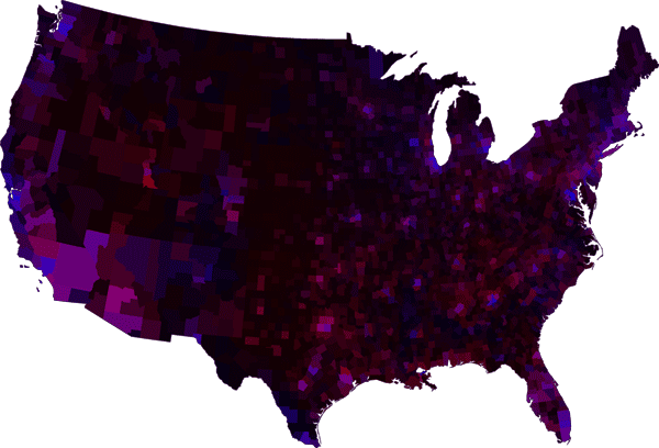
To close, it is worth providing an example of the value-by-alpha technique besides the election theme of everything posted so far. Below is a version of a map made by Rob Roth and Jin Chen at Penn State for some research they’re involved with. With a diverging color scheme it shows cervical cancer mortality rates by US county, above and below the national rate. Instead of using a VBA map to equalize by some variable of magnitude, this map uses it to display a measure of statistical reliability. A county’s alpha value corresponds to a score that indicates how reliably it lies in a cluster of elevated cervical cancer mortality, resulting in the spotlight effect on those important regions. Before I do more injustice to this work, check out the fully detailed poster (PDF) available on Rob’s ludicrously thorough online CV.

Paper citation
Roth RE, AW Woodruff, and ZF Johnson. 2010. Value-by-alpha Maps: An alternative technique to the cartogram. The Cartographic Journal. 47(2).
It is probably not permissible for me to post the paper online, but anybody who has read this far is probably an academic with access to the journal.
Tagged Academic, vlaue by alpha
13 Comments